Design vun engem personaliséierte Email Pin ass e spannende kreative Prozess. Et ass eng Geleeënheet eng Iddi ze maachen - e Marklogo, e Konschtstéck, e memorablen Slogan - an e konkreten, wearable Objet. Awer et ass och e Prozess voller eenzegaartegen techneschen Erausfuerderungen. E Bild dat beandrockend op engem Computerbildschierm ausgesäit, ka séier zu engem onschëllegen, onliesbare Mess ginn, wann net mam kierperleche Fabrikatiounsprozess am Kapp entworf ass.
Dëst ass wou sou vill Projete Frustratioun begéinen. Déi gutt Noriicht? Et ass komplett vermeidbar. Mat e bësse Expertise kënnt Dir en Design erstellen deen net nëmme schéin ass, awer och perfekt fir d'Produktioun optimiséiert. Als féierende Pin Hiersteller hu mir Dausende vu Clienten guidéiert, vu professionelle Grafiker bis éischte Kéier Creatoren, duerch dëse ganz Prozess. Mir hu gesinn wat funktionnéiert, wat net a firwat.
Dësen definitive Guide ass eise Wee fir dës Expertise mat Iech ze deelen. Mir ginn Iech duerch déi zéng kriteschst Designregelen, déi suergen, datt Äert Schlussprodukt eppes ass, op wat Dir stolz kënnt. Egal ob Dir en erfuerene Kënschtler sidd oder op enger Servietten skizzéiert, dës Tipps ginn Iech d'Vertraue fir en onvergiessleche Reverspin ze kreéieren. Fir e kompletten Iwwerbléck iwwer de ganze Kreatiounsprozess vun Ufank bis Enn, kënnt Dir ëmmer op eis zréckhänken Ultimate Guide fir Benotzerdefinéiert Lapel Pins.
Inhaltsverzeechnes
Tipp 1: Start mat engem klore Konzept an Zweck
Ier Dir eng eenzeg Zeil zitt, ass de wichtegste Schrëtt de "firwat" hannert Ärem Pin ze definéieren. E super Pin ass net nëmmen eng zoufälleg Sammlung vu coolen Elementer; et ass e fokusséierte Message geliwwert an engem klenge Pak. E kloeren Zweck féiert all eenzel Designdecisioun déi Dir maacht, vu Faarfwahl bis zur definitiver Form.
Wat ass d'Haaptaarbecht vum Pin?
Frot Iech selwer wat Dir wëllt datt dëse Pin erreechen. Seng Funktioun wäert säin Design dramatesch beaflossen.
- Fir Corporate Branding: D'Zil ass direkt Unerkennung a Professionalitéit. Den Design soll propper sinn, ronderëm Äre Logo zentréiert a Markefaarwen korrekt benotzen. Eng schlank Hard Email Finish gëtt dacks bevorzugt fir seng Bijou-ähnlech Qualitéit.
- Fir e Promotiouns Giveaway: D'Zil ass opfälleg an onvergiesslech ze sinn. Dëst ass wou Dir méi hell Faarwen, lëschteg Formen a vläicht e clevere Slogan benotze kënnt. Käschte-Effizienz ass Schlëssel, mécht Soft Email eng populär Wiel.
- Fir Employé Unerkennung: D'Zil ass Wäert an Éier ze vermëttelen. Den Design sollt prestigiéis fillen, vläicht de Firmelogo mat Text wéi "5 Joer Service" integréieren. Metallesch Finishen wéi poléiert oder antik Gold funktionnéieren gutt. Gesinn e super Beispill an eiser Fallstudie iwwer Mataarbechter Moral Pins.
- Fir Retail oder Artist Merchandise: D'Zil ass kreativ Ausdrock a Sammelbarkeet. Dëst ass wou Dir déi meescht Fräiheet hutt. Den Design ass d'Produkt, also Eenzegaartegkeet an héich artistesch Qualitéit si wichteg.
Wien ass Är Zilgrupp?
Design fir e Firmechef ass ganz anescht wéi Design fir e Museksfestival Participant. Denkt un wien dëse Pin kritt an droen. Wéi eng Stiler resonéiere mat hinnen? En Design fir eng Jugendsportteam kéint fett a spilleresch sinn, während e Pin fir eng professionell Associatioun méi ënnersträicht an elegant sollt sinn.
Tipp 2: Emprise Einfachheet a Boltness
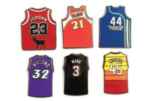
Dëst ass vläicht déi widderholl, a wichtegst Rotschléi am Pin Design: manner ass méi. Äre Canvas ass kleng, dacks net méi grouss wéi e Véierel. Designen déi ze komplex sinn, voll oder voll mat klengen Detailer verléieren hiren Impakt a kënnen onliesbar ginn wann se op esou enger klenger Skala produzéiert ginn.
Firwat funktionnéiert Einfachheet sou gutt fir Pins?
E Pin gëtt meeschtens vun enger Distanz gekuckt, op engem Revers, Jackett oder Rucksak. En einfachen, fett Design mat proppere Linnen a staarke Faarfkontrast wäert direkt erkennbar a visuell attraktiv sinn. E cluttered Design gesäit just aus wéi e konfus Smudge vun e puer Meter ewech. D'Zil ass en Design ze kreéieren dee kloer an virsiichteg ass, fir datt Äre Kärmessage net am Kaméidi verluer geet.
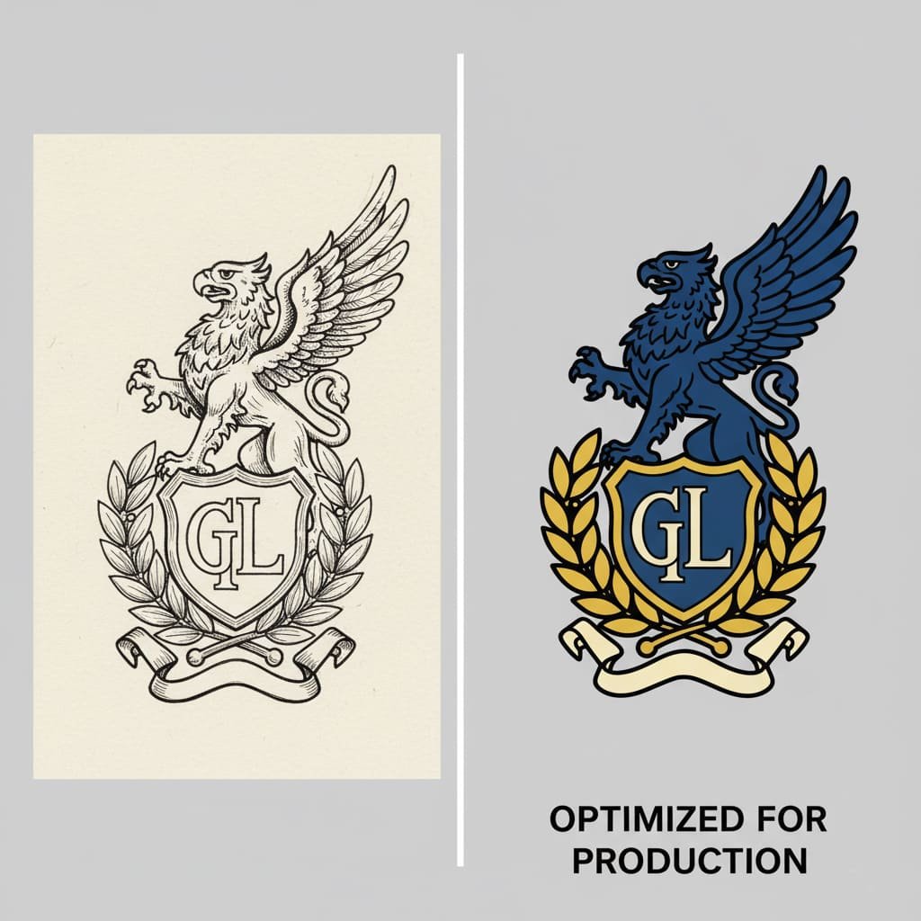
Tipp 3: Master d'Regele vu Linnen a Faarwen
Dëst ass deen techneschsten a kriteschen Deel vum Pin Design. Verstinn wéi Metalllinnen an Emaille Faarwen an der kierperlecher Welt interagéieren ass net verhandelbar. Et ass den Ënnerscheed tëscht engem professionelle Beweis an engem Design dee vun der Fabréck verworf gëtt.
D'Nummer 1 Regel: All Faarwen musse vu Metalllinnen getrennt sinn
Denkt un en Emaille Pin wéi eng Glasfënster oder e Faarfbuch. Déi opgehuewe Metalllinnen (genannt "stierwen Linnen") handelen als Maueren déi de flëssege Emailleck enthalen. Ouni dës Mauere géifen d'Faarwen während der Produktioun zesummen bléien. Dofir, all eenzel Faarfberäich an Ärem Design muss komplett vun engem Metallkontur zougemaach ginn. Faarwe kënnen sech net direkt beréieren.
Minimum Dicke a Gebitt verstoen
Wärend eis Fabréckstechnologie onheemlech präzis ass, schaffe mir nach ëmmer mat kierperleche Materialien. Wann d'Linnen ze dënn sinn oder d'Faarfflächen ze kleng sinn, kënnen se net zouverlässeg fabrizéiert ginn.
Wesentlech Fabrikatioun Spezifikatioune
| Design Element | Minimum Gréisst / Dicke | Firwat ass et eng Regel |
|---|---|---|
| Metal Linn Dicke | 0.2 mm (ongeféier 0,75 pkt Schlag) | Assuréiert datt d'Metallmauer staark genuch ass fir net beim Stamping ze briechen an d'Email richteg ze enthalen. |
| Faarf Fëllung Beräich | 0.3mm breet | Garantéiert datt de flëssege Email komplett an de Raum fléien kann an e festen Faarfberäich kreéieren. |
Benotzt Pantone (PMS) fir perfekt Faarfmatching
D'Faarwen déi Dir op Ärem Écran gesitt (RGB) sinn anescht wéi d'Faarwen am Drock (CMYK), a béid sinn ënnerschiddlech vun Emaillemolerei. Fir sécherzestellen datt Äre spezifesche Schatt vu rout vun Ärer Mark mat perfekter Genauegkeet reproduzéiert gëtt, benotzt d'ganz Fabrikatiounsindustrie Pantone Matching System (PMS). Dëst ass eng standardiséiert Faarfbibliothéik wou all Faarf e spezifesche Code huet. D'PMS Coden fir Ären Design ubidden ass deen eenzege Wee fir präzis Faarfresultater ze garantéieren. Wann Dir se net kennt, kann eis Team Iech hëllefen, de nootste Match ze fannen. Fir e méi déif Verständnis, entdeckt eise Guide iwwer firwat Pantone passende ass kritesch fir Är Mark.
Kënnt Dir Gradienten oder Schatten benotzen?
Nee Den traditionelle Email-Pin-Prozess funktionnéiert nëmme mat festen, flaach Faarwen. Gradienten, Schatten a fotografesch Elementer kënnen net reproduzéiert ginn. Wann dës essentiell fir Ären Design sinn, ass d'Léisung fir eng ze wielen Gedréckt Pin, deen Ären Design direkt op d'Metallbasis dréckt an se mat enger Epoxykuppel versiegelt. Léiert méi an eisem Guide iwwer wéini gedréckte Pins ze wielen.
Tipp 4: Maacht Ären Text kloer a liesbar
Text op engem Pin abegraff kann onheemlech effektiv sinn, awer et ass och eng vun den einfachsten Saachen fir falsch ze ginn. Illesible Text ass eng verschwonnen Geleeënheet. Wéinst der klenger Skala erfuerdert d'Typographie eng virsiichteg Planung.
Wéi sécherzestellen datt Ären Text liesbar ass
- Halt et kuerz: Dir hutt net Plaz fir e Paragraph. Bleift op e puer wesentlech Wierder - e Markennumm, en Datum, e kuerze Slogan. Eng gutt Fauschtregel ass ënner 10-15 Wierder am Ganzen ze bleiwen.
- Wielt einfach, fett Schrëften: Propper, sans-serif Schrëften (wéi Arial, Helvetica) si bal ëmmer déi bescht Wiel. Iwwerdäiss dekorativ, dënn oder Skript Schrëften ginn onméiglech ze liesen wann se op d'Pingréisst geschrumpft ginn.
- Respektéiert d'Mindestgréisst: Fir den Text liesbar ze sinn, muss et u Mindestgréisstbeschränkungen halen.
Typographie Richtlinnen fir Benotzerdefinéiert Pins
| Element | Minimum Ufuerderung | Grond |
|---|---|---|
| Schrëftgréisst | 5-6pt | Assuréiert Basis Liesbarkeet fir eng Standard sans-serif Schrëft. |
| Schlagdicke (vu Buschtawen) | 0.2mm | Garantéiert d'Metall kann d'Bréifform korrekt bilden. |
| Enclosed Space (z.B. bannent engem 'O') | 0.3 mm | Erlaabt Plaz fir d'Email ze fëllen, wann zoutrëfft. |
E kriteschen technesche Schrëtt: Konvertéiert Text an Outlines
An Ärer digitaler Designdatei ass Ären Text méiglecherweis eng editéierbar Schrëft. Wann eis Designer déi exakt Schrëft net installéiert hunn, wäert hire Computer se ersetzen, an Ären Design ruinéieren. Fir dëst ze verhënneren, musst Dir konvertéiert all Text op Konturen (oder Kéiren) ier Dir d'Datei schéckt. Dëst verwandelt d'Bréiwer a fixe Vektorformen, sou datt se genau ausgesinn wéi Dir et virgesinn hutt, egal wien d'Datei opmaacht.
Tipp 5: Wielt déi richteg Gréisst a Form fir Ären Zweck
Déi kierperlech Dimensiounen vun Ärem Pin sinn e Kär Deel vu sengem Design an Impakt. Dës Entscheedung sollt e Gläichgewiicht tëscht Detail, Verschleibarkeet a Budget sinn.
Wat ass déi allgemeng Pin Gréisst?
Déi grouss Majoritéit vu personaliséierte Lapel Pins falen tëscht 1,0 Zoll an 1,5 Zoll. Dëse Gamme vu Gréisst bitt e super Gläichgewiicht: grouss genuch fir e gudde Betrag un Detailer ze weisen, awer kleng a liicht genuch fir bequem op enger Jackett, Lanyard oder Rucksak ze droen.
- Ënner 1.0 Zoll: Bescht fir ganz einfach Logoen oder Symboler. Subtil a professionell.
- 1.0" - 1.5": Déi versatile Séiss Plaz fir déi meescht Designen.
- 1.75" - 2.0"+: Betruecht grouss. Excellent fir Handel Pins oder detailléiert Konschtstécker, awer ka schwéier sinn.
D'Gréisst vun Ärem Pin huet och en direkten Impakt op d'Finale Käschten. Fir e kompletten Decompte, konsultéiert eis Insider kuckt wéi d'Pingréisst d'Käschte beaflosst.
Pro Tipp: En einfache Wee fir d'endgülteg Gréisst ze visualiséieren ass Ären Design op Pabeier a senger aktueller Gréisst ze drécken an auszeschneiden. Dëst gëtt Iech eng real Welt Sënn vu senger Skala an Impakt.
Denken ausserhalb vun der Këscht mat personaliséierte Formen
Fillt Iech net op Kreeser a Quadraten ageschränkt! Ee vun de beschte Saachen iwwer personaliséiert Pins ass datt se a bal all Form geschnidden kënne ginn. Eng personaliséiert Form déi de Kontur vun Ärem Design follegt ass méi dynamesch, opfälleg a fillt sech méi eenzegaarteg. Dëst ass ouni extra Käschten abegraff an ass e fantastesche Wee fir Äre Pin erauszestellen.
D'Form vun Ärem Pin ass grad esou wichteg wéi den Design dobannen. Eng kreativ Form kann en einfache Logo an e memorablen Erënnerung maachen. Et ass en einfache Wee fir Ären Design z'erhéijen ouni d'Käschte ze erhéijen.
Tipp 6: Benotzt d'Metallplating als Designelement
Vill nei Designer denken un d'Metalllinnen nëmmen als néideg Grenzen. Awer Expert Designer wëssen datt d'Metall selwer eng Schlësselfaarf an Ärer Palette ass. D'Wiel vun der Metallplack kann d'Stëmmung an den Impakt vun Ärem Konschtwierk dramatesch änneren.
Wéi wielen ech eng komplementär Plating
Denkt un Kontrast an Harmonie. Är Email Faarwen soll mat, net géint, Är gewielt Metal Ofschloss Aarbecht.
- Poléiert Gold: Klassesch a prestigiéist. Et mécht donkel Faarwen wéi Marineblo, déif rout, a Bëschgréng "Pop" mat engem räiche Kontrast.
- Poléiert Sëlwer / Nickel: Modern a villsäiteg. Et funktionnéiert gutt mat de meeschte Faarwen awer kann heiansdo ganz hell Faarwen wéi hellgiel oder wäiss wäschen.
- Black Nickel: Gemittlech an zäitgenëssesch. Et bitt e fantastesche Kontrast fir ganz hell, vibrant oder Neon Faarwen.
- Antik Finishen (Gold / Sëlwer / Bronze): Dës hunn eng méi däischter, ageschniddene Textur déi perfekt ass fir e vintage Gefill ze addéieren oder fein Detailer ze markéieren stierwen (keng Faarf) Pins.
Ier Dir Är Faarwen finaliséiert, setzt se nieft Ärer virgesinner Plattfaarf an Ärer Designsoftware. Dësen einfache Scheck ca
Tipp 7: Füügt speziell Effekter a Featuren Duerchduechte
Wann Dir Ären Design op den nächsten Niveau wëllt huelen, kënnen eng Vielfalt vu Spezialeffekter bäigefüügt ginn. Wann Dir richteg benotzt, kënnen dës Äre Pin e richtegt Standout Stéck maachen. Wéi och ëmmer, benotzt se virsiichteg fir Ären Design ze verbesseren, net ze iwwerwannen.
Populär Spezial Features
- Glitter Email: Füügt Glanz a visuell Interesse fir spezifesch Faarfberäicher. Perfekt fir magesch oder feierlech Designen.
- Glow-in-the-Dark Email: Eng lëschteg Iwwerraschung déi Deeler vun Ärem Pin mécht, nodeems se am Liicht gelueden sinn.
- Duerchsichteg Email: Erstellt e schéine Glasfënstereffekt wann se iwwer eng texturéiert Metallberäich applizéiert ginn.
- Spinner, Sliders, Danglers: Dës addéiere kinetesch, interaktiv Elementer op Äre Pin, sou datt se héich sammelbar sinn, awer och d'Käschte erhéijen.
Fir en detailléierte Bléck op dës Optiounen a wéi se de Präis beaflossen, kuckt eis Guide fir Spezialeffekter fir Pins.
Tipp 8: Design fir Strukturell Integritéit (Ausschnëtter)
Huel Gebidder, oder "Ausschnëtter", kënne vill visuell Interesse fir e Pin addéieren, en negativen Raum erstellen deen den Design méi hell a méi komplizéiert fillt. Wéi och ëmmer, dës Lächer musse mat der kierperlecher Kraaft vum Metall am Kapp entworf ginn.
D'Regele fir Ausschnëtter
Wann e Ausschnëttberäich ze kleng ass oder ze no bei engem delikaten Deel vum Pin ass, kann et d'Metall verursaachen, ze béien oder ze briechen während dem Héichdrockstempelprozess.
Richtlinnen fir Cutout Designs
| Pin Dicke | Minimum banneschten Lach Gréisst |
|---|---|
| 1,0 mm - 2,0 mm (Standard) | Op d'mannst 1,5 mm |
| 3,0 mm (Extra déck) | Op d'mannst 2,5 mm |
Fir méi komplex Designen mat multiple Niveauen, musst Dir vläicht eng 3D Schimmel berücksichtegen. Léiert méi an eisem Guide vergläichen 3D vs 2D Schimmel fir Benotzerdefinéiert Pins.
Tipp 9: Bereet Äert Konschtwierk fir d'Fabréck vir
Dir hutt Ären Design ofgeschloss. De leschte Schrëtt ass d'digitale Datei richteg virzebereeden. Eng Fabréck-prett Datei ubidden wäert de Prozess beschleunegen an de Risiko vu Feeler an der Iwwersetzung miniméieren.
Vektor ass Bescht: Déi ideal Dateiformate
De Goldstandard fir Pin Fabrikatioun ass a vektor Datei. Am Géigesaz zu Pixel-baséiert Biller (wéi JPGs), Vecteure sinn aus mathematesch Linnen a Kéiren gemaach. Dëst bedeit datt se op all Gréisst skaléiert kënne ginn ouni e bësse Qualitéit ze verléieren, wat essentiell ass fir e perfekte Schimmel ze kreéieren.
- Preferenze Formater:
.AI(Adobe Illustrator),.EPS,.PDF(aus Vektorsoftware gespäichert),.SVG. - Akzeptabel Formater: Wann Dir keng Vektordatei hutt, eng Héichopléisende Rasterdatei (
.JPG,.PNG,.PSD) bei 300 DPI oder méi wäert schaffen. Eis Kënschtler mussen et dann manuell an e Vektorformat fir d'Produktioun nei zeechnen. Dëst ass e wesentleche Schrëtt, wéi an eisem erkläert Einfach Guide fir Vector Artwork fir Net-Designer.
Fir eng exzellent extern Ressource iwwer dëst Thema, kuckt dëst Raster vs Vector Erklärer vun Adobe.
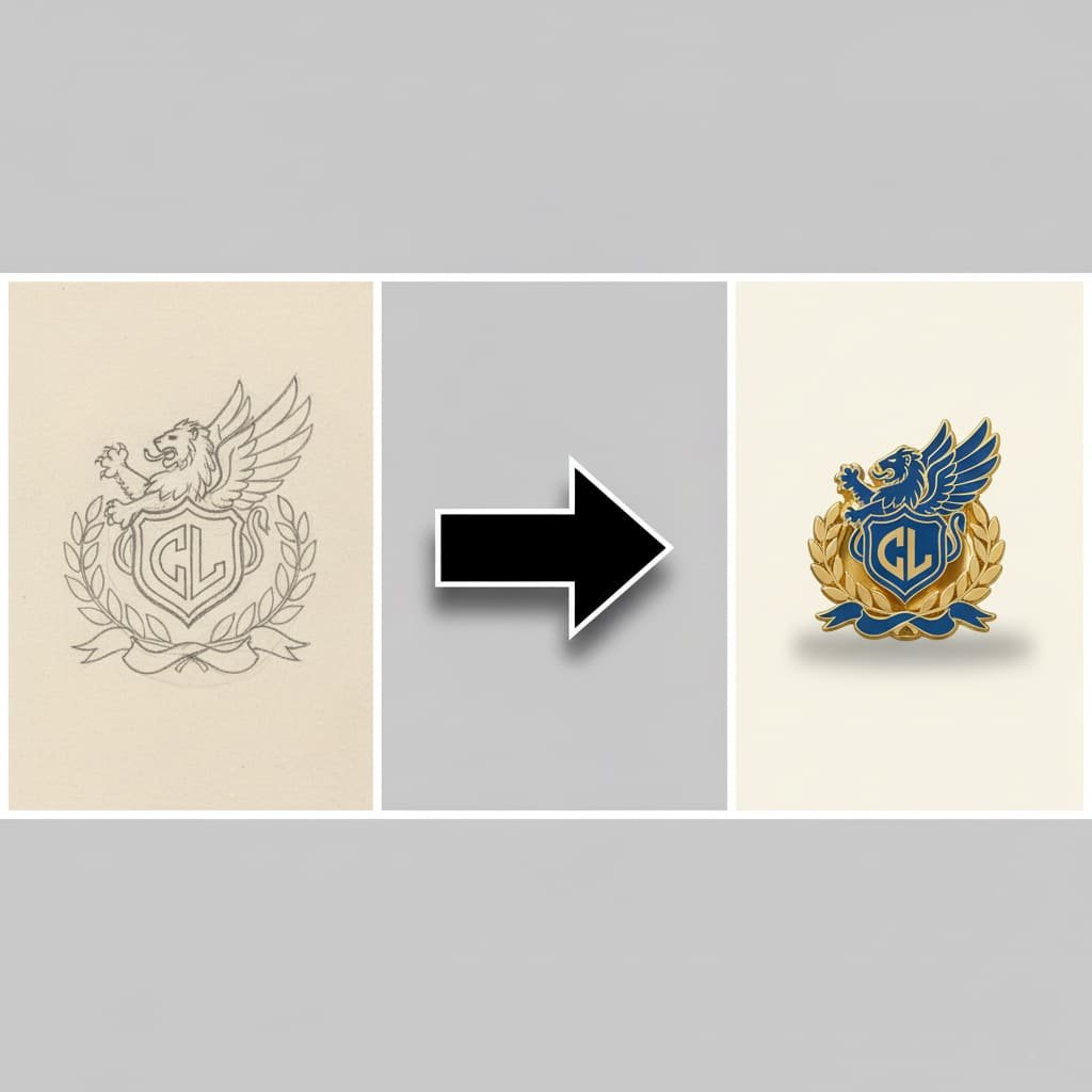
Wat wann ech nëmmen eng handgezeechent Skizz hunn?
Dat ass ganz gutt! Eng kloer Skizz op Pabeier ass alles wat mir brauchen fir unzefänken. Maacht just eng héichqualitativ Foto oder scannt Är Zeechnung. Eist professionnellt Designteam wäert Är Skizz an en digitalen, Produktiounsbereet Beweis fir Är Genehmegung maachen, an dëse Service ass komplett gratis.
Tipp 10: Vergiesst net de Réck vum Pin
Wärend jidderee sech op d'Front konzentréiert, bitt de Réck vum Pin Méiglechkeete fir béid Funktioun a Branding.
Wielt déi richteg Zuel vu Posts
Eng eenzeg Post am Zentrum ass Standard fir déi meescht Pins ënner 1,25 Zoll. Wéi och ëmmer, fir méi grouss, méi laang oder onregelméisseg geformte Pins ass et recommandéiert ze benotzen zwee Pin posts. Dëst bitt zwee Kontaktpunkte, verhënnert datt de Pin ronderëm dréint wann se gedroen ginn an et vill méi sécher mécht. Dir kënnt all Optiounen entdecken an Den Ultimate Guide fir Pin Backings & Uschlëss.
Füügt e Custom Backstamp fir Branding
E Backstamp ass Äre Logo, Websäit URL oder Markennumm liicht op de Réck vum Pin gedréckt. Et ass en onheemlech professionellen Touch deen e wahrscheinleche Wäert bäidréit an d'Leit erënnert wou hir fantastesch Pin hierkënnt. Et ass e subtilt awer mächteg Marketinginstrument dat de Pin als Är eege originell Kreatioun markéiert.
Fazit: Dir sidd prett fir ze designen
Den Design vun engem personaliséierten Emaille Pin muss net intimiderend sinn. Andeems Dir dës zéng kritesch Tipps befollegt, kënnt Dir de Gruef tëscht kreativer Visioun an der Fabrikatiounsrealitéit iwwerbrécken. Vun der Grënnung vun engem klore Konzept an ëmfaassend Simplicitéit fir d'technesch Reegele vu Linnen, Faarwen a Dateivirbereedung ze beherrschen, hutt Dir elo d'Expertwëssen fir en Design ze kreéieren deen effektiv, schéin a prett fir d'Produktioun ass. Fir potenziell Kappwéi ze vermeiden, gitt sécher eise Guide iwwer de Top 7 Feeler fir ze vermeiden wann Dir personaliséiert Pins bestellt.
Denkt drun datt Dir net eleng an dësem Prozess sidd. E super Fabrikatiounspartner schafft mat Iech, iwwerpréift Är Konschtwierker a gëtt professionelle Feedback fir dat bescht méiglech Resultat ze garantéieren. Elo, gitt Är Kreativitéit entlooss an designt en onvergiessleche Pin!
Prett Ären Design zum Liewen ze bréngen?
Dir hutt d'Wëssen, elo ass et Zäit de nächste Schrëtt ze huelen. Eist Team vun Expert Designer ass prett Är Iddi ze huelen - egal ob et eng fäerdeg Vektordatei oder eng einfach Skizz ass - an et an e gratis, professionnelle digitale Beweis fir Är Iwwerpréiwung ze maachen. Et gi keng Käschten a keng Verpflichtung.