Kerneproblemet: Hvorfor farverne på din skærm er en løgn
The root of all color confusion in manufacturing begins with the device you are using to read this. The beautiful, vibrant colors on your computer monitor, smartphone, or tablet are created with light. This is called the RGB color model, and it’s designed for digital displays. Your office printer, on the other hand, creates color by mixing tiny dots of ink, a process called the CMYK color model. Ingen af disse kan garantere, hvordan et parti fysisk emaljemaling vil se ud i den virkelige verden under naturligt lys. Den samme digitale designfil vil fremstå som en lidt anden blå nuance på en iPhone i forhold til en Android, på en Mac i forhold til en pc, og anderledes igen, når den udskrives på et visitkort. Denne inkonsistens er et mareridt for ethvert mærke, der er afhængig af en bestemt farve for genkendelse. For brandkonsistens er "tæt nok" aldrig godt nok.RGB vs. CMYK vs. Pantone (PMS): En simpel forklaring
For at løse problemet med farveinkonsekvens havde fremstillingsverdenen brug for et universelt sprog. Lad os nedbryde de tre vigtigste farvesystemer for at forstå, hvorfor Pantone er den eneste, der virker til fysiske produkter som emaljestifter.RGB: Lysets sprog (kun for skærme)
- Hvad er det: Et "additiv" system, der blander sig Red, Green, og Blue lys for at skabe de farver, du ser på en skærm. Sort er fraværet af alt lys, mens hvid er alle tre farver ved deres højeste intensitet.
- Analogi: Tænk på det som farvede spotlights på en mørk scene. Ved at blande lysene kan du skabe nye farver.
- Hvorfor det mislykkes for pins: Du kan ikke fremstille en fysisk genstand ud fra lys. Det er det forkerte sprog til jobbet.
CMYK: Blækkets sprog (til papirudskrivning)
- Hvad er det: Et "subtraktivt" system, der bruger bittesmå prikker af Cyan, Magent, Yellow, og Key (sort) blæk for at skabe illusionen af et fuldt spektrum af farver.
- Analogi: Tænk på en maler, der blander primære akvareller på en palet for at skabe nye nuancer.
- Hvorfor det mislykkes for pins: Emaljemaling påføres ikke i små, blandede prikker. Det er et enkelt, solidt farveparti. CMYK-"opskriften" på dit brands blå kan ikke nøjagtigt oversættes til en emaljemalingsformel. Den ene undtagelse er for trykte stifter, som bruger en CMYK-proces.
Pantone (PMS): The Language of Manufacturing (Guldstandarden)
- Hvad er det: De Pantone Mvedhæftning Ssystem. Det er ikke en måde at blande farver på; det er et standardiseret bibliotek med over tusind foruddefinerede, solide farver. Hver farve har et unikt, universelt navn og kode (f.eks. PMS 186 C).
- Analogi: Tænk på det som at gå til en avanceret malerbutik. Du gætter ikke på blandingen. Du vælger en bestemt farveprøve fra en fysisk bog - som "Benjamin Moore Chantilly Lace" - og butikken giver dig en dåse med den præcise, perfekt formulerede maling. Hver dåse i den farve i verden er identisk.
- Hvorfor det er perfekt til pins: It is a universal recipe. When you tell our factory “PMS 186 C,” our technicians know the exact formula to mix our enamel pigments to create that precise shade of red, every single time. There is no guesswork.
Ultimate Color System Comparison Table
Key Differences Between Color Systems
| Feature | RGB | CMYK | Pantone (PMS) |
|---|---|---|---|
| Full Name | Red, Green, Blue | Cyan, Magenta, Yellow, Key (Black) | Pantone Matching System |
| How it Works | Additive (Mixing Light) | Subtractive (Mixing Ink Dots) | Spot Color (Pre-mixed Formula) |
| Used For | Digital Screens (Websites, Apps) | Paper Printing (Brochures, Books) | Physical Products (Pins, Apparel, etc.) |
| Consistency | Low (Varies screen to screen) | Medium (Varies printer to printer) | Extremely High (Universal Standard) |
| Is it for Pins? | Ingen. Cannot be manufactured. | Ingen. Cannot be translated to enamel paint. | Ja. Dette er den krævede professionelle standard. |
Fra kode til farve: Pantone-processen på fabriksgulvet
Så hvordan bruger vi egentlig en Pantone-kode til at oprette din fysiske pinkode? Dette kig bag kulisserne vil vise dig, hvorfor det er en proces bygget på præcision og fysiske referencer, ikke digitalt gætværk. Denne detaljegrad er noget, du bør forvente, når du vælg en pålidelig producent af brugerdefinerede stifter.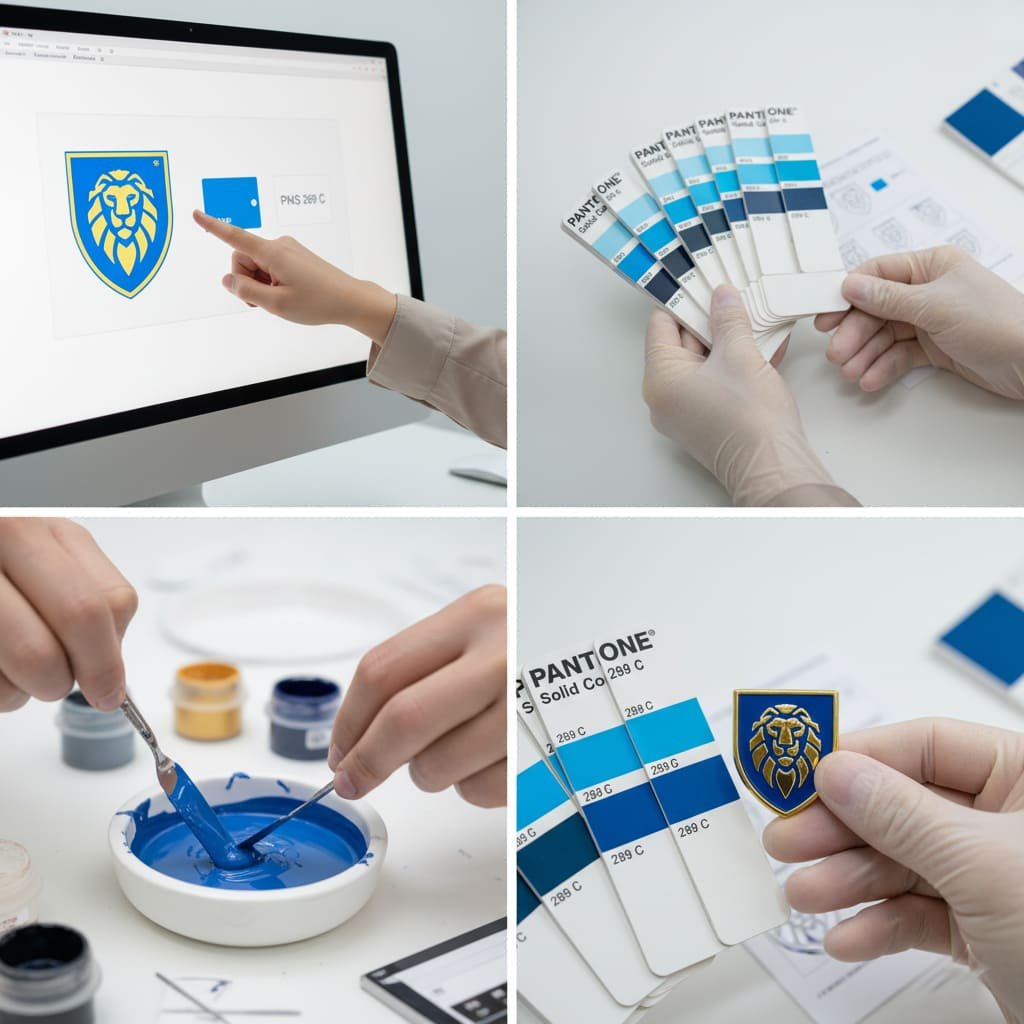
- Trin 1: Modtagelse af "Opskriften" i dit kunstværk. Det hele starter, når vi modtager din fabriksklar vektorkunst. Denne fil bør angive de nøjagtige Pantone (PMS) koder for hvert enkelt farveområde i dit design.
- Trin 2: Konsultation af Master Guide. Vores teknikere stoler ikke på deres computerskærme. De åbner en fysisk, officiel Pantone Solid Coated swatch book. This book is the single source of truth for color in the manufacturing world.
- Step 3: Mixing the Enamel with Precision. Every Pantone color has a specific, documented formula of base pigments. Our team uses precision scales to weigh and mix the enamel colors according to this exact formula, creating a perfect batch of your brand’s color.
- Step 4: Verification and Quality Control. Before filling the full order, we apply a small amount of the mixed enamel to a test piece and cure it in the oven. We then take this physical test swatch and compare it directly against the swatch in the official Pantone book under controlled lighting. Only after we have confirmed a perfect match do we proceed with the full production run.
A computer screen can betray you. A Pantone book cannot. It is our factory’s bible. We mix, test, and match to that physical swatch, because that is the only way to guarantee the color our client approved is the color they receive. There are no shortcuts to brand consistency.
An Expert’s Perspective: The Nuances and Limitations
As a manufacturer committed to transparency, it’s important to be honest about the realities of working with physical materials. While Pantone matching provides incredible accuracy, there are a few factors that can cause very minor, subtle variations.- The Baking Process: The high heat used to cure enamel can cause colors to shift very slightly. For example, certain reds can darken a tiny bit, and some oranges can become marginally more yellow.
- Influence of Plating Color: The metal finish surrounding the enamel can subtly influence how we perceive its color due to light reflection. A blue surrounded by shiny gold may appear slightly warmer than the exact same blue surrounded by matte black nickel. To learn more about these options, see our Visuel guide til metalbelægningsmuligheder.
- Texture and Finish: The same PMS color can look slightly different in a textured, recessed blød emaljestift compared to a perfectly flat, polished hard enamel pin. This is simply due to the different ways light reflects off the two distinct surfaces. The same applies to 3D mold pins, where angles can affect perception.
- Special Effects: Additives like glitter can slightly alter the base enamel color’s appearance, as we discuss in our Guide til specialeffekter til pins.
Frequently Asked Questions About Pantone and Pins
- Is there an extra charge for Pantone color matching?
- No. Pantone matching is the standard professional process for ensuring quality. It should be included in the base price of your pins, as explained in our Komplet oversigt over pinpriser. Any company that tries to charge extra for this basic service is a major red flag.
- What happens if I don’t provide Pantone codes?
- Our expert designers will step in. We will use our professional tools and physical swatch books to select the closest possible Pantone match based on your digital file. We will then clearly present these selected PMS colors to you on your free digital proof for your final review and approval. You are always in control of the final decision.
- Do I need to own a physical Pantone book myself?
- No, you do not. While it’s an essential tool for professional graphic designers, it is our job as the manufacturer to own, maintain, and use the official, calibrated books. Your only job is to review and approve the colors listed on the digital proof we send you.
- Can you match my company’s specific CMYK color codes from our brochure?
- We cannot use CMYK codes directly, as they are a recipe for mixing ink dots on paper, not for mixing solid enamel paint. However, you can provide those CMYK values to us, and our designers will use them to find the official and correct Pantone equivalent for your approval. This differs from Die-Struck Pins, which use no color at all.