
The Core Problem: Why the Colors on Your Screen Are a Lie
The root of all color confusion in manufacturing begins with the device you are using to read this. The beautiful, vibrant colors on your computer monitor, smartphone, or tablet are created with light. This is called the RGB color model, and it’s designed for digital displays. Your office printer, on the other hand, creates color by mixing tiny dots of ink, a process called the CMYK color model. Neither of these can guarantee how a batch of physical enamel paint will look in the real world under natural light. The same digital design file will appear as a slightly different shade of blue on an iPhone versus an Android, on a Mac versus a PC, and different again when printed on a business card. This inconsistency is a nightmare for any brand that relies on a specific color for recognition. For brand consistency, “close enough” is never good enough.RGB vs. CMYK vs. Pantone (PMS): A Simple Explanation
To solve the problem of color inconsistency, the manufacturing world needed a universal language. Let’s break down the three main color systems to understand why Pantone is the only one that works for physical products like enamel pins.RGB: The Language of Light (For Screens Only)
- Apa Itu: An “additive” system that mixes Red, Green, and Blue light to create the colors you see on a screen. Black is the absence of all light, while white is all three colors at their highest intensity.
- Analogy: Think of it like colored spotlights on a dark stage. By mixing the lights, you can create new colors.
- Why It Fails for Pins: You cannot manufacture a physical object out of light. It is the wrong language for the job.
CMYK: The Language of Ink (For Paper Printing)
- Apa Itu: A “subtractive” system that uses tiny dots of Cyan, Magenta, Yellow, and Key (Black) ink to create the illusion of a full spectrum of colors.
- Analogy: Think of a painter mixing primary watercolors on a palette to create new shades.
- Why It Fails for Pins: Enamel paint is not applied in tiny, mixed dots. It’s a single, solid batch of color. The CMYK “recipe” for your brand’s blue cannot be accurately translated into an enamel paint formula. The one exception is for printed pins, which use a CMYK process.
Pantone (PMS): The Language of Manufacturing (The Gold Standard)
- Apa Itu: Itu Pantone Matching System. It is not a way of mixing colors; it is a standardized library of over a thousand pre-defined, solid colors. Each color has a unique, universal name and code (e.g., PMS 186 C).
- Analogy: Think of it like going to a high-end paint store. You don’t guess at the mix. You pick a specific swatch from a physical book—like “Benjamin Moore Chantilly Lace”—and the store gives you a can of that exact, perfectly formulated paint. Every can of that color in the world is identical.
- Why It’s Perfect for Pins: It is a universal recipe. When you tell our factory “PMS 186 C,” our technicians know the exact formula to mix our enamel pigments to create that precise shade of red, every single time. There is no guesswork.
Ultimate Color System Comparison Table
Key Differences Between Color Systems
| Fitur | RGB | CMYK | Pantone (PMS) |
|---|---|---|---|
| Full Name | Red, Green, Blue | Cyan, Magenta, Yellow, Key (Black) | Sistem Pencocokan Pantone |
| How it Works | Additive (Mixing Light) | Subtractive (Mixing Ink Dots) | Spot Color (Pre-mixed Formula) |
| Used For | Digital Screens (Websites, Apps) | Paper Printing (Brochures, Books) | Physical Products (Pins, Apparel, etc.) |
| Consistency | Low (Varies screen to screen) | Medium (Varies printer to printer) | Extremely High (Universal Standard) |
| Is it for Pins? | TIDAK. Cannot be manufactured. | TIDAK. Cannot be translated to enamel paint. | Yes. This is the required professional standard. |
From Code to Color: The Pantone Process on the Factory Floor
So, how do we actually use a Pantone code to create your physical pin? This behind-the-scenes look will show you why it’s a process built on precision and physical references, not digital guesswork. This level of detail is something you should expect when you choose a reliable custom pin manufacturer.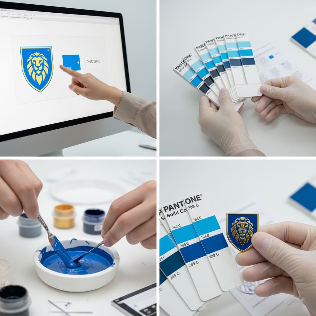
- Step 1: Receiving the “Recipe” in Your Artwork. It all starts when we receive your factory-ready vector artwork. This file should specify the exact Pantone (PMS) codes for each individual color area in your design.
- Step 2: Consulting the Master Guide. Our technicians do not trust their computer monitors. They open a physical, official Pantone Solid Coated swatch book. This book is the single source of truth for color in the manufacturing world.
- Step 3: Mixing the Enamel with Precision. Every Pantone color has a specific, documented formula of base pigments. Our team uses precision scales to weigh and mix the enamel colors according to this exact formula, creating a perfect batch of your brand’s color.
- Step 4: Verification and Quality Control. Before filling the full order, we apply a small amount of the mixed enamel to a test piece and cure it in the oven. We then take this physical test swatch and compare it directly against the swatch in the official Pantone book under controlled lighting. Only after we have confirmed a perfect match do we proceed with the full production run.
A computer screen can betray you. A Pantone book cannot. It is our factory’s bible. We mix, test, and match to that physical swatch, because that is the only way to guarantee the color our client approved is the color they receive. There are no shortcuts to brand consistency.
An Expert’s Perspective: The Nuances and Limitations
As a manufacturer committed to transparency, it’s important to be honest about the realities of working with physical materials. While Pantone matching provides incredible accuracy, there are a few factors that can cause very minor, subtle variations.- The Baking Process: The high heat used to cure enamel can cause colors to shift very slightly. For example, certain reds can darken a tiny bit, and some oranges can become marginally more yellow.
- Influence of Plating Color: The metal finish surrounding the enamel can subtly influence how we perceive its color due to light reflection. A blue surrounded by shiny gold may appear slightly warmer than the exact same blue surrounded by matte black nickel. To learn more about these options, see our Panduan Visual untuk Opsi Pelapisan Logam.
- Texture and Finish: The same PMS color can look slightly different in a textured, recessed pin enamel lembut compared to a perfectly flat, polished hard enamel pin. This is simply due to the different ways light reflects off the two distinct surfaces. The same applies to 3D mold pins, where angles can affect perception.
- Special Effects: Additives like glitter can slightly alter the base enamel color’s appearance, as we discuss in our Panduan Efek Khusus untuk Pin.
Frequently Asked Questions About Pantone and Pins
- Is there an extra charge for Pantone color matching?
- No. Pantone matching is the standard professional process for ensuring quality. It should be included in the base price of your pins, as explained in our Rincian Lengkap Harga Pin. Any company that tries to charge extra for this basic service is a major red flag.
- What happens if I don’t provide Pantone codes?
- Our expert designers will step in. We will use our professional tools and physical swatch books to select the closest possible Pantone match based on your digital file. We will then clearly present these selected PMS colors to you on your free digital proof for your final review and approval. You are always in control of the final decision.
- Do I need to own a physical Pantone book myself?
- No, you do not. While it’s an essential tool for professional graphic designers, it is our job as the manufacturer to own, maintain, and use the official, calibrated books. Your only job is to review and approve the colors listed on the digital proof we send you.
- Can you match my company’s specific CMYK color codes from our brochure?
- We cannot use CMYK codes directly, as they are a recipe for mixing ink dots on paper, not for mixing solid enamel paint. However, you can provide those CMYK values to us, and our designers will use them to find the official and correct Pantone equivalent for your approval. This differs from Pin Mati, which use no color at all.